

Two very similar subjects;
two very different
visual effects.
My first post-college job was as a commercial photographer, a career that spanned a decade and led to some pretty interesting situations and stories. The vast majority of my commercial work was in color, from 35mm though 8×10 film.
My personal work, however, remained all black and white. Oh, sure, I shot a lot of color slide film on trips and color print film for family events, but my personal work – for fun, for art or whatever – remained almost exclusively black and white.
I’d go into the woods with a heavy 4×5 view camera, a huge wooden tripod and a bag with a couple lenses, filters and a couple of dozen sheets of film.
Yep, two dozen sheets tops.
And – on most days – that was more than enough, for many reasons:
- Knowledge that only a handful of shots could be taken made one choose subjects carefully and compose with deliberation
- The primitive nature of the view camera slowed down the entire shooting process. You had to set up the camera on the tripod, focus under a focusing hood, manually meter (or guesstimate) the exposure and then stick a film holder into the back and manually fire the lens.
- Just lugging the equipment around slowed everything and took its toll physically. We’re not talking point-and-shoot photography here. The exact opposite.
But I loved it then; I’d still like to do it, but I won’t – I’ve gone digital.
After pretty much being out of the game for over a decade – and doing little to no photography in the interim – I got a digital camera and have been having a blast with it.
But that’s not what I want to write about today.
I want to talk about how digital photography – with is basically the overwhelming choice today and will be the de-facto standard tomorrow – is killing black & white photography.
I don’t mean this in an old fuddy-duddy “Blasted cars! I liked walking 12 miles though the snow to work” way. Just a lament that acknowledges how the reality of today is causing the death of something I care about: black & white (BW) photography.
How is digital killing BW photography?
- Digital cameras are color cameras. The is no film choice, just a sensor (CCD – charge-coupled-device) that has RGB (red/green/blue) receptors.
- While most (many?) digital cameras have the option to take pictures in gray-scale mode, why would anyone – even me – bother? Shoot in color and then – later – convert to grayscale in just about any image-editing software (Photoshop et al) if desired.
- Even with the grayscale mode, the picture quality is the same BW or color in digital. It’s all the pixels, my friend… In film, BW kicks color film’s butt all over the place. I remember the first time I printed shots taken with a high quality BW film of a model I shot in a studio. WOW! Every eyelash, flecks of darkness in her iris all there. To get the same quality in color you’d need to move up from 35mm (which I was then shooting) to either 2 1/4 or 4×5 formats.
- I loved the weird BW films – especially the infrared and recording film stocks. The former rendered skies and water nearly black, any sunlit foliage glowing white; the latter had a very grainy result which was a great effect for some subjects. While you can approximate these effects with imaging software, one of the pleasures of these oddball films was the surprise factor. Even if you were really good with the films (this is especially true of IR film), it was often impossible to really tell what the end result was going to look like. Shots you think would be brilliant would be flat; the shot of a glass of water, for example, could turn out complex and beautiful. Digital with color is more WYSIWYG.
- When shooting BW, there is a certain mindset – you look at things differently. Because that red rock won’t be red – it’ll be a dark gray. You (should ideally) look at things more abstractly because, without the color, a subject is only gradients of gray and the composition. A bright red rose in color is easy; much like sunsets. To make either interesting in BW takes some effort.
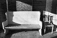 In the same vein as the preceding point, there are subjects that just work better in BW than color precisely because they are reduced to gradients of gray the composition. Weathered wood – a side of a barn, driftwood, fallen tree … – works better in BW (to me) because all you see are the subtle shadows and grain; you’re not distracted by the color. Take the pic to the right – I took this about 25 years ago, I remember a lot of details about the location and so on, but I can’t remember the colors. But what if the brick behind the chairs was vivid red? The siding color blue? It would detract from the what the BW photo currently is – two chairs. In BW, that’s where your eye goes: Right to those chairs. I call this pic my Laurel (fat) and Hardy (skinny) chairs pic. Some pictures can really only be in BW to have the desired impact. The same is true for color photos, I agree. It’s just that we’re losing BW…
- Part of my sorrow with the loss of BW is the death of the darkroom, as well. While I’ve developed and printed color, this is really something that I always left to the labs. It’s hard and temperatures have to be precise, chemicals fresh (chemicals are more toxic, as well). But part of the beauty of BW was taking that negative into the darkroom – that unassuming negative – and coming out with magic thanks to one’s darkroom skills and the arsenal of darkroom tricks. The dodging and burning, using straight Dektol or going soft with Selectol, posterizing, the vastly different interpretation of a negative two Agfa BW papers – Portriga-Rapid vs. Brovira – could bring to a print. And the smell of fix and glacial acidic acid…
What does all this mean? I don’t really know, but I do think we’ll see less and less BW photography.
Which is a shame because a good BW photograph – from Ansel Adams through Diane Arbus to Robert Mapplethorpe – is something we need more of. They – and a cast of a thousand others – have provided beauty that is of this world but just one step removed.
Removed of color.


