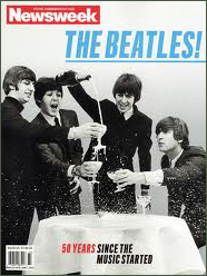
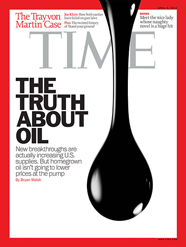
Now, I know I’ve ragged about the shameful quality of Newsweek magazine’s covers over the last year or so, but this week brought another disastrous example.
And it can’t be just the financial straits of the company – they did a great job last week with the “Mad Men” cover (and the retro ads throughout the issue; just brilliant). So they are up to the job.
And Time magazine, which is Newsweek’s closest competitor, is in the same boat as Newsweek (hemorrhaging readers/ad dollars), so comparing their covers should be a pretty much apples-to-apples job.
Well, here are the first issues of April 2012 for each magazine; you decide:


Any questions? Time’s cover is minimalist but well laid out; good contrast.
Newsweek’s is a grainy picture with some helvetica condensed italic type slapped on randomly. It looks like I designed the cover – about 20 years ago. Just awful.
Which would you rather read?
