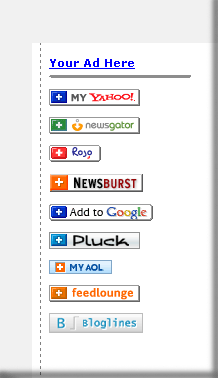
 I pulled this part of a screenshot fron BoingBoing today (4/26/2006); I mean them no harm, BB’s was just the first example of what I mean by:
What’s Wrong With RSS – Caveat: I’m not talking about the politics between RSS (0.92/1.0/2.0) and Atom; rather, I’m using RSS as a collective noun for the whole syndication mess. It’s a mess in several ways, but I’m thinking about the non-nerd user.
- Why all the buttons?
- Because this (and other) sites want to make sure you can, essentially, bookmark (i.e. subscribe) to the site’s feed regardless of your aggregator/reader. OK…
- Why all the buttons?
- Because there isn’t a standard for this crap. Virtually everyone uses one browser; you bookmark there. Why not have a default aggregater/reader (hell, it should be the browser!)? One click! Maybe it’s an OS default. Whatever.
- What’s the issue with all the buttons?
- Until you make subscribing to RSS feeds as easy as bookmarking – which is not a gimme for many, so put that in your pipe and smoke it – this clutter of buttons is going to alienate what I call the “my mom” audience: As in, “hmm…could/would mom do it?” And “mom” is 90% of the Internet audience (probably a much lower percentage of traffic/online time etc; agreed); the geeks who know to subscribe to this for MyYahoo vs. NewsGator etc…you’ve won them already. Get the rest by simplifying.
In other words, make RSS = KISS (keep it simple, stupid) and you’ve got a winner.
And think of the screen real estate – and coding – is saved.
I’m sorry, but I don’t see the downside to this proposal.
